Tableau Guide #2: Making Pass Maps
The second instalment of the series where I guide you on how to make data visualisations with Tableau
I recommend reading TabGuide #1 to get you up-to grips with some of the techniques mentioned here. This is a much longer piece and will have more parts to it. Thanks for dropping by :)
Required Data Structure
To make a pass-map in Tableau, all you need your data to have are four values- X and Y coordinates for the start location of the pass and the end location of the pass. Most importantly, you need a unique identifier like event ID. Ideally, you’d also need the player who made the pass and the player who received the pass and maybe the length. Anything else like opponent and under pressure is also helpful. But for the purpose of this tutorial, we just want to plot a basic pass map.
head(FinalData)
Get your data (Skip this section if you ‘ave it already)
If you don’t already have this type of data to work with, I’m going to show you one method in R to extract said data from StatsBomb. And as Torvaney once said, and I incorrectly paraphrase, if you have the misfortune of being stuck with Python, may god help you.
Python Method
Yes, I was kidding. I’m sure there’s a way to scrape StatsBomb data off Python, I just don’t know how. Until then you can use this wonderful tool built by Imran Khan here. Just hit events, enter the MatchID and you your event data will be downloaded in csv format. You can also check out his github here where he walks you through how to convert Statsbomb data into csv format.

The caveat of this method is that it only gives you data for one single match. If you want data for the entire season, what you can do is download all the data from all matches from one season into a folder and run this code to combine them. Or you can use the one I’ve already made for you from the 2010/11 Barcelona season here.
import osimport globimport pandas as pd#set working directoryos.chdir("Enter your working directory here")extension = 'csv'all_filenames = [i for i in glob.glob('*.{}'.format(extension))]combined_csv = pd.concat([pd.read_csv(f) for f in all_filenames ])#export to csvcombined_csv.to_csv("combined_csv.csv", index=False, encoding='utf-8-sig')
R Method
Again, this is heavily inspired from Mark Wilkins’ blog, Go follow biscuitchaser on Twitter and have a look at his blog piece here. I wouldn’t have been able to write this guide if not for him.
Step 1: Download the statsbomb package by using devtools. Don’t forget to sign their user agreement. Skip this step if you’ve already downloaded the package
#download the Stasbomb package
#Skip this block if you already have the package
#------------------------------------------------
library(devtools)
devtools::install_github("statsbomb/StatsBombR")
#------------------------------------------------
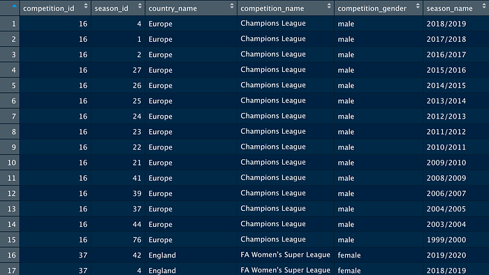
Step 2: First, load up the statsBombR package, then you can check the competitions available for free.
library(StatsBombR) #load your statsBomb packageComp<-FreeCompetitions() #see the competitions available
View(Comp)
Step 3:
Now, let’s say you want Champions League Data from 2018/19. You will run the following piece of code, change the filters -competition_id to 16 and season_name to “2018/19”. I am going to go ahead with La Liga data from 2018/19.
#entire your desired season here within the filtersMatch<-FreeCompetitions()%>%filter(competition_id==11, season_name=="2018/2019") AllMatches<-FreeMatches(Match) #get all matches from desired season
Step 4:
Run these lines of code to get clean event data from 2018/19 La Liga. To get a more detailed explanation and understand why, you can head over to Mark’s piece linked earlier.
EventData<-StatsBombFreeEvents(MatchesDF = AllMatches, Parallel = T)
CleanData = allclean(EventData)
Step 5:
Now this data is vast, we don’t need all of it. Hence, I’m going to use a subset function to only select passing events.
PassData = subset(CleanData,CleanData$type.name == "Pass")Now, I will further break it down be selecting only some columns from this table
subsetFunc = c("id","player.name","pass.length","pass.recipient.name","location.x","location.y","pass.end_location.x","pass.end_location.y")FinalData = PassData[subsetFunc] #this is your final dataset
Step 6: Export as csv to your desired location
setwd("~/Downloads") #set your desired export location herewrite.csv(FinalData,"LaLiga1819Pass.csv", row.names = FALSE) #export data
Data Prep
Open up this data in excel or google sheets as we need to do some minor data prep
Step 1: Create a New Column named path, and make sure every value is 1. (You will also have a ID column, which isn’t seen in this screenshot)

Step 2: Duplicate the sheet and using the find and replace option, replace all these 1’s with 2.

Step 3: Copy this duplicate sheet data and paste this data under the first sheet
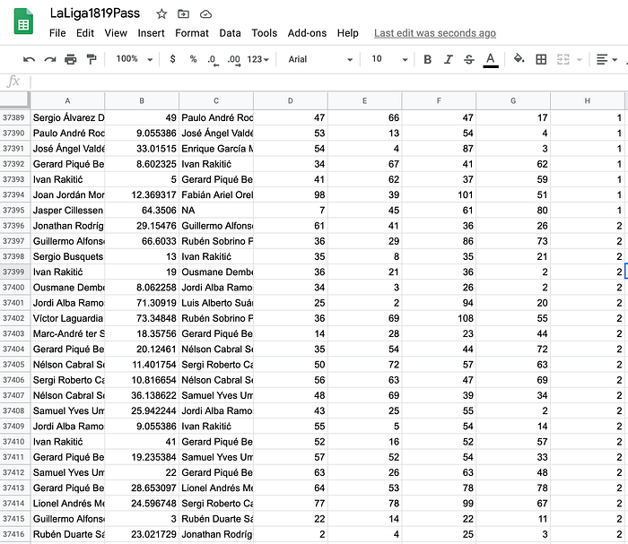
What we are looking for is the exact same data twice, one with an entry of 1 in the path column and the other with an entry of 2. If you cannot use find and replace, simply copy pasting should work.
Build your PassMap in Tableau
After saving/downloading your data, pull it inside Tableau.
Step 1: Creating calculated fields
First create a calculated field, called X Value and insert the following chunk of code.

IF [Path] = 1 THEN [location.x]
ELSE [pass.end_location.x]
END------IF [Path] = 1 THEN [location.y]
ELSE [pass.end_location.y]
END
You have to do the same for Y value as well, and use location.y and pass.end.location.y instead. What we are doing is telling Tableau that for every unique ID, if the path is 1, the x and y locations are the starting x and y locations and if the path is 2, the x and y locations are the ending x and y locations of the pass. We can use this information to basically draw lines from path 1 to path 2.
Step 2: Pull X Value to columns and Y value to rows and change them into dimensions.

You now have this map in front of you

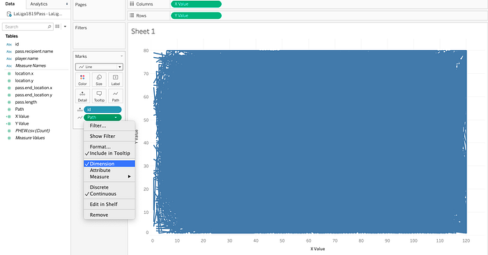
Step 3: Change the marks to line and drag path to path.

Step 4: Convert that path into dimension and drag id or any unique identifier to detail and your passmap is now ready. It’s a giant box of blue because of the sheer number of events in this dataset.
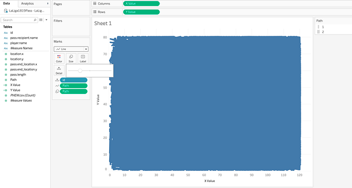
Step 5: Drag path to size, convert to dimension and resize it accordingly, so that 1 is smaller and 2 is slightly bigger
Step 6: Fix the x-axis values by double clicking

Important: Fix the y-axis values and click on reversed since Statsbomb reverses it’s y-axis data.
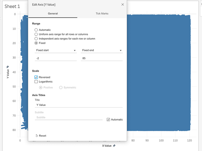
Step 7: Remove all grid lines and zero lines and axis rulers by clicking on None.

Step 8 : Download your Tableau pitch map
Go to James Smith’s website HERE and download the football pitch template. I’d recommend checking out his article here on Medium if you need further help. This is what the image looks like

Step 9: Click on Maps > Background Images > Data source

Use the image mentioned above with the following specifications
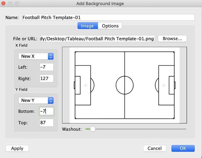
Once you hide the headers, your passmap is now ready.

Don’t worry, we can make this look a lot better by filtering out some of the data and using further cosmetics. Adjust the sizes, and then edit your title using insert.

Drag player name and pass recipient name to filters and choose one particular player.

Here are Messi’s passes to Arthur in the 2018/19 season

You can also make a dashboard out of it, into something like this

If you’re a fan of dark themed maps, go into MSPaint or a website like pinetools.com and invert your image’s colors. Or you can do it in Tableau as well
Go to format dashboard and change the default shading to black, also change the worksheet titles font to white.

Now go to format shading for each and every sheet, and change shading to none, thus making the graphs transparent

This is what your graph will look like.
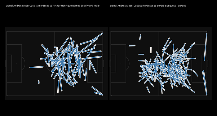
I personally prefer inverting my graph online, but I wanted to provide you with an easier time-saving Tableau alternative
Here is what the final result will look like. Feel free to play around with the data, sizing and filters for different better-looking graphs.

If you’ve stuck till the end, thank you. I’ll let you know that the next guide will go into advanced math and how to incorporate xT into Tableau. Thank you for reading.
