Tableau Guide #3: Convex Hulls
Creating Convex Hulls after integrating R with Tableau
Convex hulls are very easy to do in R, the following graphic can be produced in just 5 lines of code. This guide tells you how to make the very same graphic by integrating R with Tableau.
x = df[c('endX','endY')]ch <- chull(x)
coords <- x[c(ch, ch[1]), ]plot(x, pch=19, col = 'blue')
polygon(coords, col = rgb(0,0,1,alpha = 0.1))
Integrating R with Tableau
Do read the CRAN docs , here if you wish to understand the package in more detail.
There are some great guides out there that teach you how to integrate R with Tableau, this one by Ben Moss, this one by Emily and this video by Art of Visualisation is a great place to start.
Still, I will tell you how to do it yourself in this guide.
I am using R-studio and I’m using macOS.
First, download and load the necessary packages
install.packages(“Rserve”)install.packages(“RSclient”)library(Rserve)
library(RSclient)
Then, run this line of code which starts up your Rserve session
Rserve(args=” — no-save”,port = 6311)
Leave RStudio open. Open Tableau Desktop. You need to click on Help > Settings and Performance > Manage Analytics Extension Connection

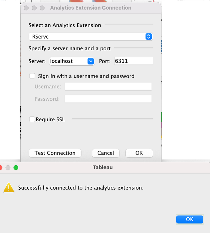
A window will pop up, make sure you specify the server as ‘localhost’ and the port as 6311. Click on test connection, after the successful connection, click ok on both and you have successfully integrated R and Tableau.
Creating the visualisation
I’ve already written TabGuide #1, which went in depth on how to plot a shot map. It has a section on how to add a football pitch to your tableau visualisation which you can do before/after making this visualisation.
Make sure you edit your bounds based on your data and whether it’s in a 100*100 format or a 120*80 format.
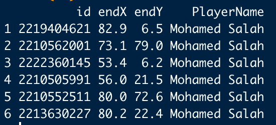
The data I’m using for this project is x,y coordinate data for passes received for Liverpool and Manchester City for the first 8 game-weeks or so. The data primarily requires just 4 things, a unique identifier (a S.no will also work), a x-coordinate, a y-coordinate and other data qualifiers, like ‘Name’ and if needed, ‘Club’ and so on.
When you pull this data into tableau, make sure your unique identifier column is a dimension, if not, you should convert into a dimension from a measure.
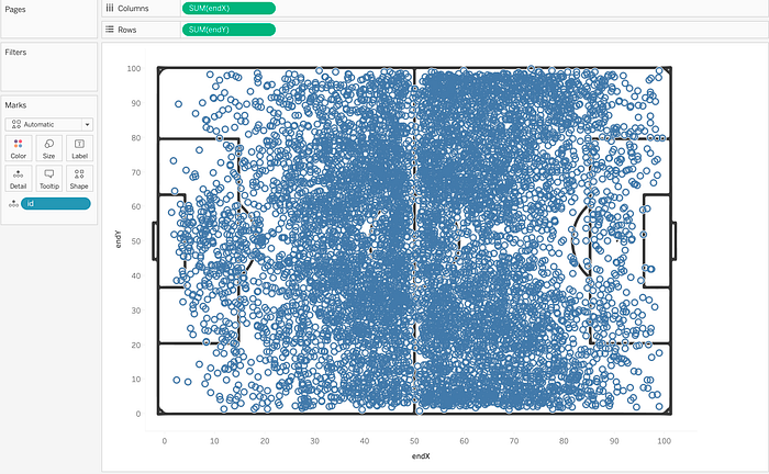
After pulling the data into Tableau, we go about making the map like we used to, dragging the x-coordinate to columns, y-coordinate to rows, and the unique identifier to detail. If you have read my earlier guides, arriving at this point isn’t difficult for you.
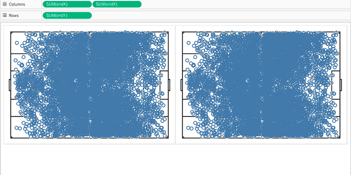
Now, we will drag sum(endX) again to columns, creating a map like this
Then, we will change the mark types, and adjust the transparencies. Change the mark type of the second chart to ‘polygon’ and reduce the opacity to around 50%.
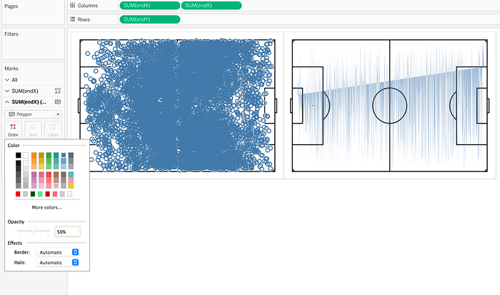
You will then right click on sum(endX) and make it a dual axis, and also synchronise the axes .

Now, we get to the meat of the guide, making the convex hull. You will now make a table calculation that does it all.
You have to ensure one thing, that your unique identifier column is called ‘id’ or you can change every instance of ‘id’ in this table calculation with whatever your unique id is called.
To learn more about this code, please head over to Ben Moss’s blog, where you can learn a lot about Tableau and understand the inner workings of this code. This article is what helped me make this guide.

Table calc for the lazy people
SCRIPT_REAL("
values <- chull(.arg1, .arg2)
valuesdf <- data.frame(id = unlist(values))
valuesdf$PathID <- 1:nrow(valuesdf)
list <- .arg3
listdf <- data.frame(id = unlist(list))
listdf$id = 1:nrow(listdf)
finaltable <- merge(x= valuesdf, y = listdf, by.x = 'id', by.y = 'id', all.y = TRUE)
finaltable$PathID
"
,
SUM([endX]),SUM([endY]),ATTR([id])
)
Now, you will drag this table calculation to path under the second marks page and make sure you compute this calculation using your unique id.
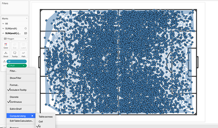
Then you will also drag this calculation to colour on the second marks page and convert the color to discrete. Once again make sure that this ‘color’ is also computed using your unique id.
Depending on the size of your dataset, each step might take anywhere from 1–3 minutes to load. Don’t worry about that.

After all the formatting, you are almost there. This is what it should like, on the right hand side, you will right click on ‘Null’ and hide it. The trick here is to not filter it out, instead to hide using the color.

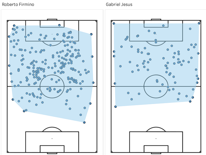
Your convex hull viz is now complete.

You can then add your own touch to the graph via cosmetics, and feel free to filter the points to only specific players, the convex hull will automatically adjust.
Closing your Rserve Session gracefully
After closing your Tableau app, you can go back into RStudio and run these two lines of code which will shut down your Rserve session.
rsc <- RSconnect(port = 6311)RSshutdown(rsc)
