Tableau Guide #4 : Football Radars
A quick guide on how to produce radar charts in Tableau
Introduction
we must always redistribute knowledge — Nandy
A few things before I start this guide- I’ll keep this guide short as this one’s intended for those who have a good amount of experience in both Tableau and data prepping. There might be parts you may get stuck in, but for every doubt, there is usually always a Google search to provide a solution and me, who’s always ready to help you out on Twitter.
When I came up with this template, I tired to get it as similar to the folks at StatsPerform and most of the formulas were taken from this youtube video , which you could take a look at . If you wish to understand the intuition behind the trig formulas at a deeper level, there’s this article by Ellen which you could read.
All previous issues of my tutorials are available on my medium profile page.
The Data
If you’re looking for some metadata to get started, here’s one that I’ve scraped from understat and made open-source.
Let’s now talk about structure, usually your data might look like this-

However, that’s not the data structure we’re looking for.
We need to convert this structure into one with four columns:
- Name of the player
- Category [The Variable being measure]
- Plot Value
- Value
- Extra Variables (optional) — Team, PlayerId, etc,.
One more step is usually required, and that is to adjust the values to the point where they are proportional. Key Passes and shots are usually much higher than expected assists/90 and expected goals/90. Therefore, it’s always a good idea to standardise them to a [0,1] scale using the best performer or call in a percentile value if that’s what you prefer. You could create an extra column called ‘plot value’ and plug this value in.
Before you pull your data into Tableau, this is what it must look like.
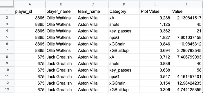
You can achieve this by using any coding programme like R or Python, or excel commands like the Transpose() function or a pivot table among others.
I’ve just taken proportional values on a [0,2] scale and also integrated a small random function. I’ve also only taken two players, Watkins and Grealish. But you can extend this by using correct data, either with a percentile or a percentage with as many players as you want. My goal is to just show you how to make the template.
Table Calculations
You will now make 4 table calculations.
Calculation 1 — The Angle
RUNNING_SUM(
2*PI()
/MIN({COUNTD([Category])}))

Calculation 2 — The Distance from the Centre
SUM([Plot Value])
Calculation 3— X Value
[Dist]*COS([Angle])
Calculation 4— Y Value
[Dist]*SIN([Angle])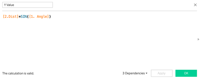
Making the Viz
Step 1: Drag Category to Marks
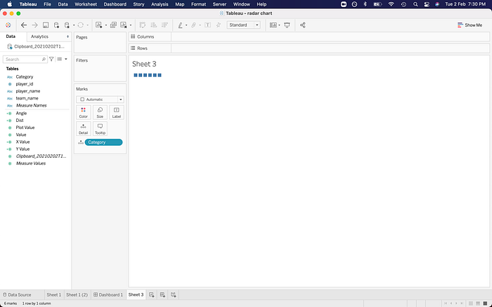
Step 2: Drag Angle to Marks

Step 3 : Compute Angle using Category, (click on it, don’t forget this step!!)
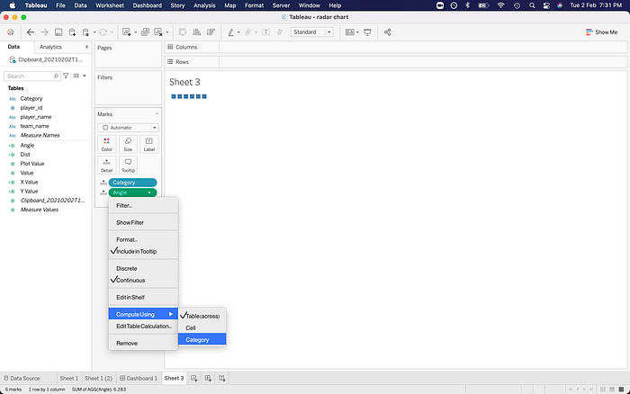
Step 4: Drag X Value to Columns and Y Value to Rows
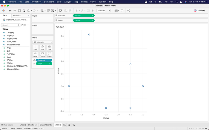
Step 5: Change chart type to Polygon under marks

Step 6: Change Angle from Detail to Path

You should now have this:

Let’s move on
Step 7: Drag player name to colour and your base is ready

Step 8: Drag Y again to rows
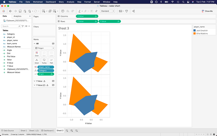
Step 9: Go to the Y Value (2) page On marks and click on circle

Step 10: You should get this, after which, you will click on dual axis.

Step 11: Sync your axis, format the grid lines away, play around with the opacities and border. The first page should have lower opacities and a black border always looks great on a light background. This is what you should have after formatting.
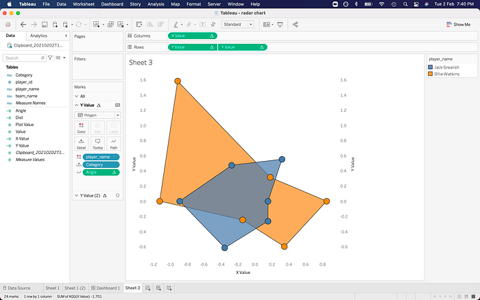
Step 12 : Edit both axes, give them a fixed range of -2.5 to 2.5 before hiding all the headers. (since I used a [0,2] scale. If you used a [0,1] scale, go for -1.5 to 1.5 or -105 to 105 for [0,100] percentile scales)

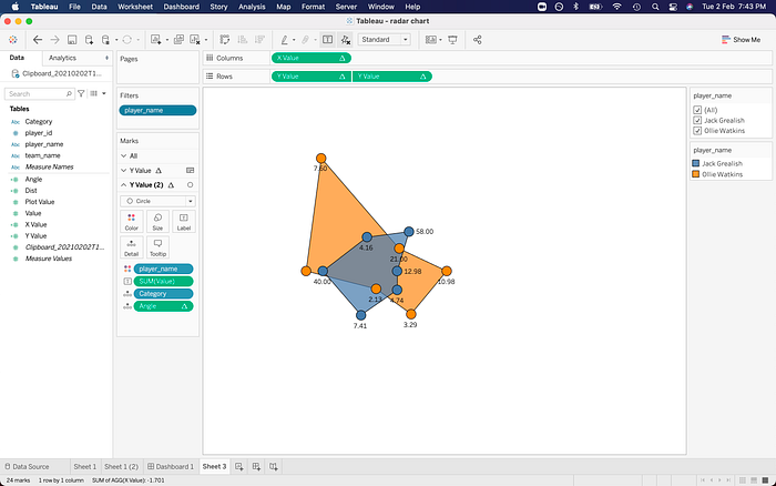
Your final radar chart should look like this

Step 13: Further beautification, change up the default colors, set up tooltips, filters, hide or edit titles, add labels (actual value, not plot value) if required. Example shown below. Go crazy with the customisation.
Step 14: Go to this LINK and download it because I have created a custom background for you all which you can use for radar chart backgrounds.
Reminder : This custom template is for analysing exactly 6 variables
Step 15: Add this image as a background from Maps >- Background Images

Use the same background limits as before and apply

Your radar chart template is ready !
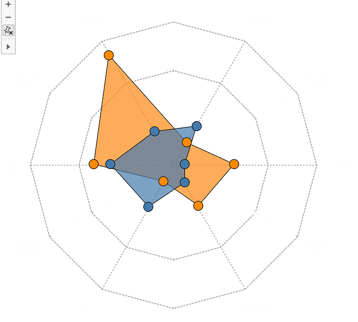
You can annotate later with MsPaint or Preview to add further details, something like this, but I’ll leave that to you.
Thanks for reading ! You can interact with me on my Twitter accounts : nandy_sd and NdyStats
